Openmove
Since 2013
Openmove is part of OpenTripPlanner, a family of open source software projects providing information and transportation network analysis service for a smarter and more sustainable mobility.
OpenMove App:
public transportation made easy
Brief
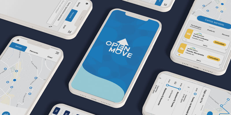
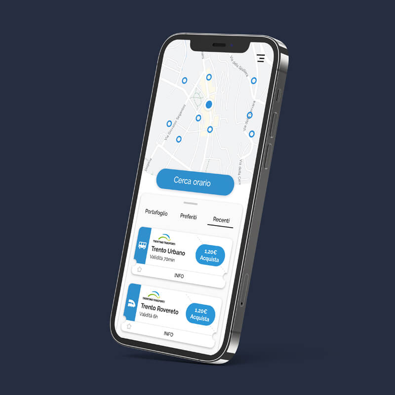
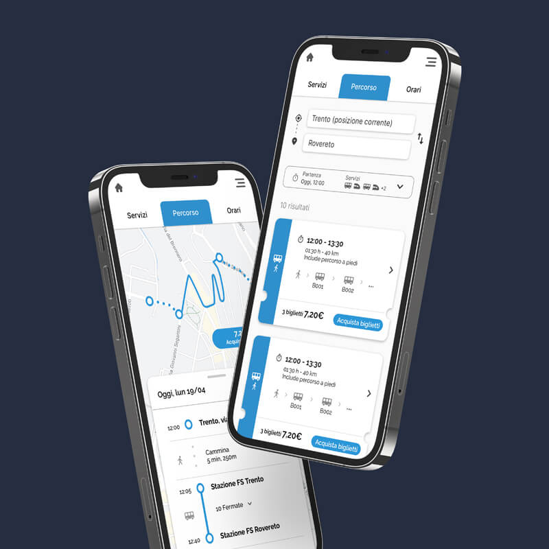
Fornace took part in the makeover of OpenMove App, a MAAS App, whose purpose is to simplify the use of public transportation through the purchase of tickets, combined tickets, seasonal tickets and the trip planner in the city of Trento.
The Application needed a strong UX in order to be daily and easily used by all kinds of users: from students, to workers and tourists.
Goals
To check and improve the UX in order to create an easy-to-use service for all kinds of users and that allows future integrations of new services, new means of transport and new cities.
Challenge
To design a strong and intuitive UX that guides the user through the navigation and the purchase of complex mobility services.

Execution
Starting from a study they made which pointed out a few flaws, we looked further into the UX to find a solution that would allow users to easily access and use the app services. To a first app design all about buying and validating bus tickets, we added some new functions such as the possibility to purchase bus passes and combined tickets for calculated trips involving more than one means of transport inside the province of Trento, and not only. In fact, we took into account the potential for further expansions of the service in other cities: the dynamic structure of the app makes it customisable and adaptable to different urban assets. The hardest part of the work was to define and follow a logical path to meet in an easy and intuitive way all the needs of a wide variety of customers, such as students, workers, tourists and more. Once the UX study was completed, we outlined some wireframes that were perfectioned by working side by side with the client, together with the final UI design. Since the app was already complex and providing a multitude of services, we chose very few colors: blue, from the logo, and white, to maximize the contrast and enhance readability.

